American Museum of Natural History

Randy and I took Monday afternoon off and went to American Museum of Natural History. There were lots of cool inspirations there, I wished we had more time…

Entrance:

Theodore Roosevelt statue:

I took some photos for my inspirations and here they are. I hope they’ll give you some ideas for your project, too…

They had lots of wild animals diorama and they were all amazing to look at. It was really lively (even though nothing was alive!) and it looked like a real wild life everyday scene. I especially liked colors and patterns on the animals.

Love the colors. Dark line gives nice impact.
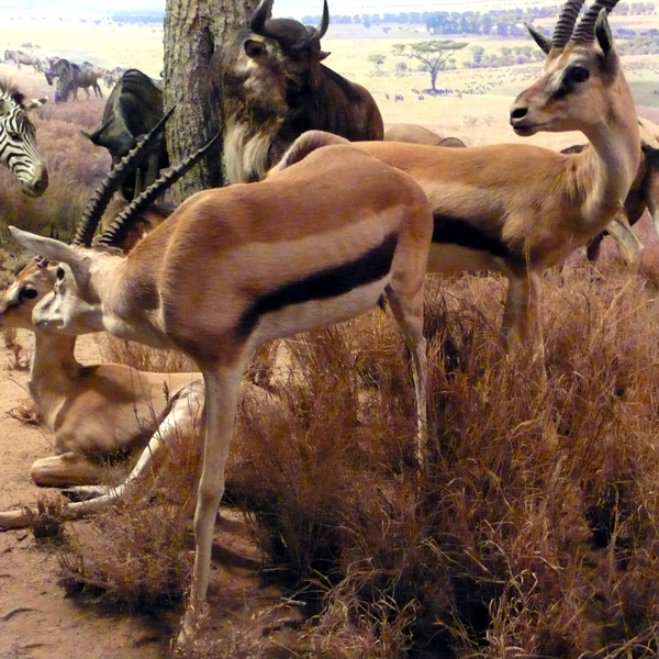
The pattern is so unique and caught my eye.
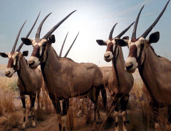
Love the stripes in just one area like this.

Simply beautiful.
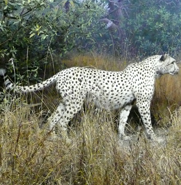
Great shapes.
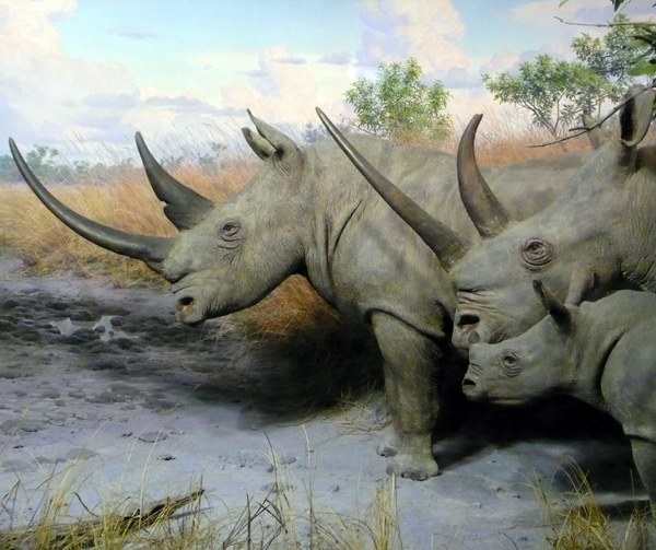
Love the composition. Dynamic.

—-

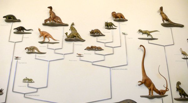
From here, it’s a dinosaur area!

Half 3D graph. Very cool.
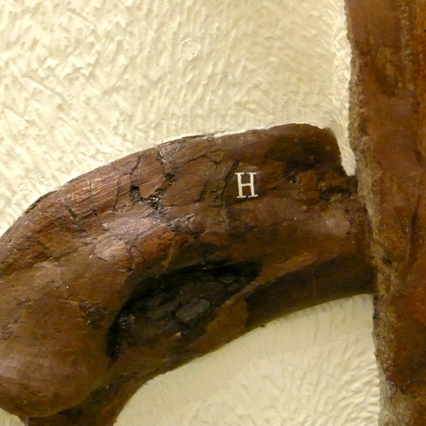
Found letter H in dinosaur’s bone.
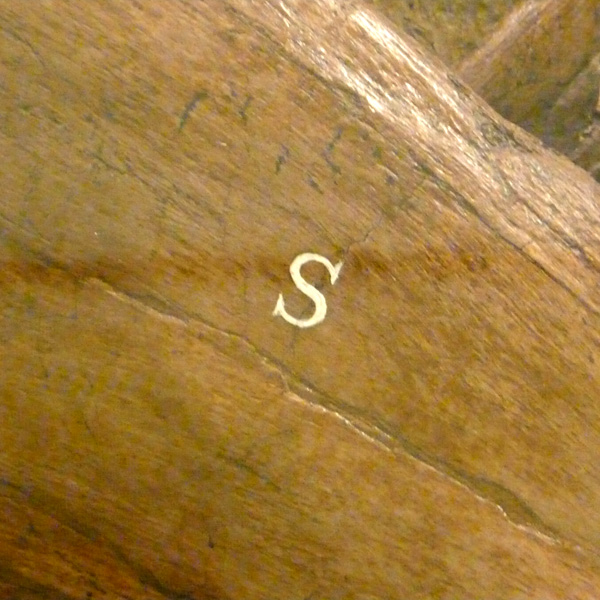
Found letter S in dinosaur’s bone.
Glass case with nice typography/description – it was so cool to look at.

wooooo. Isn’t it awesome?

Another cool glass case with typography. Love that you can see through everything with the types in front.
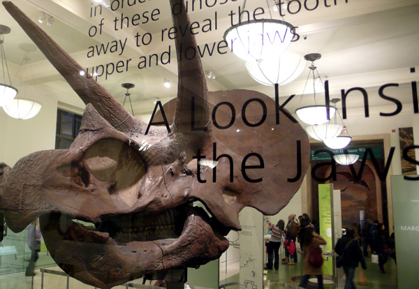
Amazing – what a horn!

Mammoth shot.

Letterpress Class 6

Last week, we learned how to die cut with Vandercook Press! I had no idea it can do die cutting so it was surprising and pretty cool!

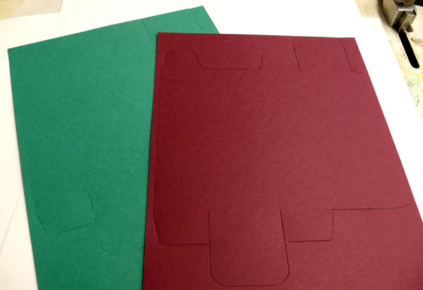
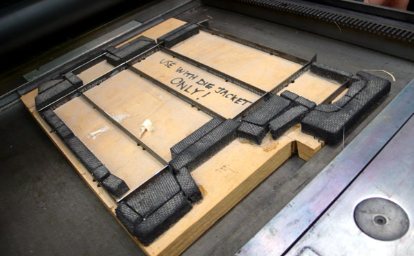
The school had a few shapes, we tried circle ones, there were rounded corner one, too, but this was the most intriguing one… a die cut for a package box!

You just set it up just like you set up a wood type or metal type on the Vandercook Press:

You don’t have to turn on the power switch to cut, you just run the paper and it die cuts!

Can you see the cut? It also had a scoring line, but due to the Press condition, we couldn’t go too far (it was cutting where it’s not supposed to) so I have to score before I build the box, but how cute would this be for a holiday candy box! I will work on it later and make sure to share it with you here.

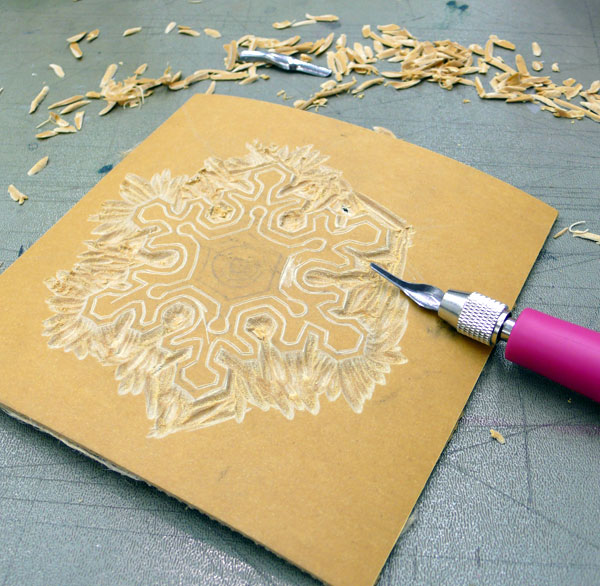
I also worked on my second linoleum art: a snowflake!

It took a little bit (and I messed up a little bit, too – but that makes it special, right?) and this is from “the making of”:

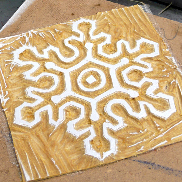
Started with white ink – I love snowflakes, I think they are absolutely beautiful and no two snowflakes are the same shape, just like my prints. :)

I printed on color papers: came out nicely.

Added a splash of blue/green:

and printed on white paper, too.

From here, I am adding types and making holiday cards, but I will hold it until it is a holiday time to show you… Please look forward to it!

YOU ROCK

I love this print by wonting… YOU ROCK!

I love the patterns and black and yellow color combination. And who doesn’t like that big ROCK!!! Very nice.

She just got a lot more new prints in her store, just in time for holidays. Thank you, Chrstine, for your wonderful work!

L.L.L.L.L.L.

I like prints and posters that remind me important things in my life and of course the typography in print/poster that is cool always catches my eye. This print from dazeychic is today’s eye candy/phrase for myself and for you:

6 Ls! They are all important thing, too. I love it.

I like the pink, white and black color combination, too.

I think I need to work on “LEAP” more, I feel like… see, it’s working! hehe