American Modern

20140114-203018.jpg

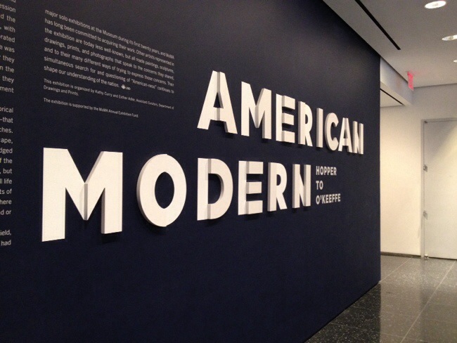
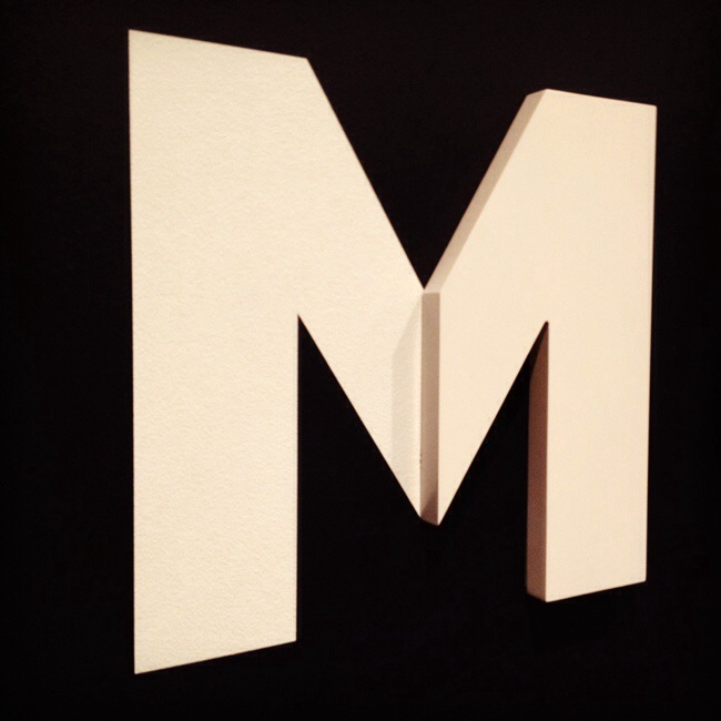
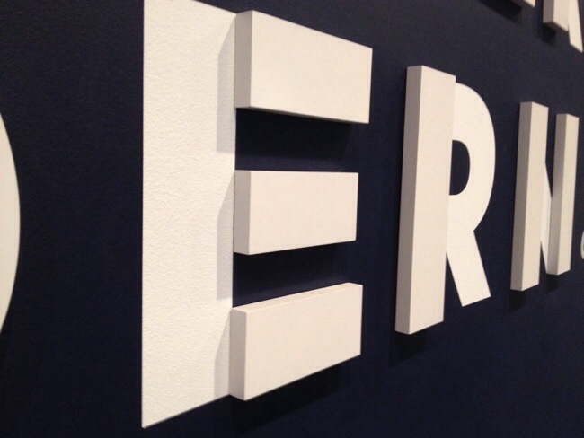
I got to go to MoMA all by myself the other day (what a treat!) and the first exhibition I saw was this “American Modern Hopper to O’Keeffe.” The typography on the entry wall caught my eye immediately — it’s half 3D!

20140114-203036.jpg

20140114-203050.jpg

The exhibition was great, I saw few more but didn’t take any photos as I’m not supposed to take some of the works. I renewed my membership, looking forward to more visits this year…

Brooklyn Roasting Company Package

Brooklyn Roasting Company

I mentioned a little bit about Brooklyn Roasting Company on Tuesday — I like not only their coffee, but also their packaging. The picture is their decaf coffee packaging. Isn’t that great?! (and they are not kidding. It’s so good.) It also comes in a tin can, which I like. You bring back the tin can, they refill it with the beans and you get a dollar off, too.

All of their coffee packaging is designed just with simple Helvetica!

Found Type: Ace Hotel

I was at a sample sale at the Ace Hotel in NYC (such a cool hotel!!) last week and look what I found — a wall full of types! That’s an eighth floor information wall you see when you just get off the elevator.

I LOVE everything about this wall. So awesome.

Everywhere you go, each turn you make, you see something so very cool in this hotel, I just wanna spend all day looking around and finding things. Could I do that, please? :)

Wood Type in the Digital Age

Last night, I was able to attend a great talk entitled “Wood Type in the Digital Age” by Nick Sherman at the Type Directors Club. As you may know, I work with wood type a lot so once I saw the title and who’s giving a talk, I was there already.

These images are from Nick’s Intercut wood typeface project, it was so great to see the process, behind the scene, his thoughts…

Pressing Letters has a nice recap from last night’s talk here.

So glad I went!! I was so inspired to do more work with wood type and do something different, too!!