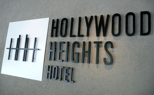
HHH

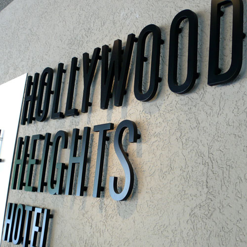
When we were in Los Angels a couple weeks ago, we stayed at Hollywood Heights Hotel for 2 nights and I couldn’t help but notice their logo. I love how they used letter H, three of them together like that, and I also love the clean condensed font for the hotel name. Very simple, modern and clever. It fits the hotel atmosphere very well. The hotel is on the hill so the logo shows around the area nicely, too, I think.

hhh2

hhh1

Pictures are from the front of the hotel. Love the 3D letters.

hhh3

Rooted in Style

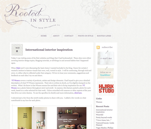
I have been working with Jana for a while on her logos and website – she is a great interior designer in bay area, just launched her new business / design blog called “Rooted in Style” and I am so honored to be a part of this exciting journey, thank you so much!

Logo design: Love the concept behind this name and her vision. We had a lot of ideas around the concept, it was fun to think and come up with different ideas. At the end, she went with more elegant and simplified version of “root” on the ground and also show a new life above the ground.

Her blog design: Her posts have been so inspirational! She featured about me on her first post, too, thank you so much!!

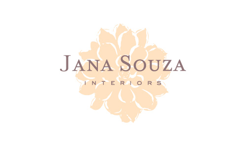
She also has an interior design studio and I got to design her logo, too:

The succulent flowers you see on her blog is coming from her interior design studio logo – they work nicely together actually – I love the background!

I am going to check out my letterpress studio today – I am renting one starting this month! Many more letterpress projects to share very soon!

From New Year’s Day

We went to eat our first brunch of the year at Apple Wood in Park Slope. We have been there for dinner a few times and noticed and liked their logo, but never got to take pictures because it was dark out.

and here it is – I like the woodcut print looking apple. Very nice. Always catches my eye.

Another Beer Table sign that caught my eye:

For New Year’s Day dinner, Randy and I always eat Sushi or Japanese New Year food (if we could) and we went to Sakura Cafe in Park Slope this year to celebrate our bright new year and it was perfect!

and one of the beers Randy had called “Ginga Kogen Beer” (imported beer from Japan) was not only a very good beer, but also a great designed beer.
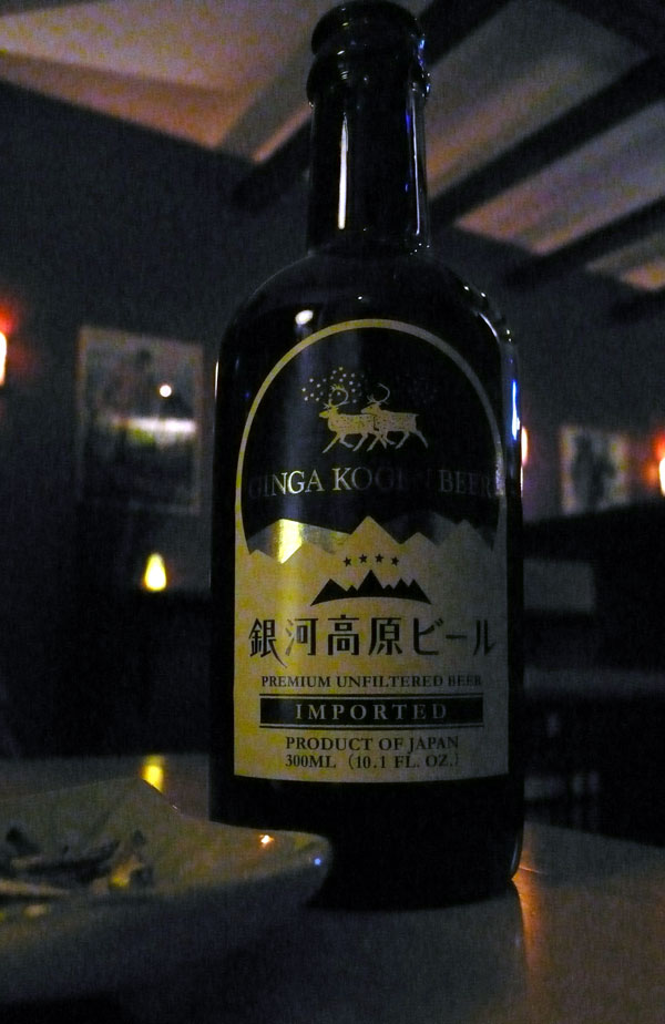
It was a bit too dark at the restaurant, but here’s a better photo – yes, it’s in blue bottle!
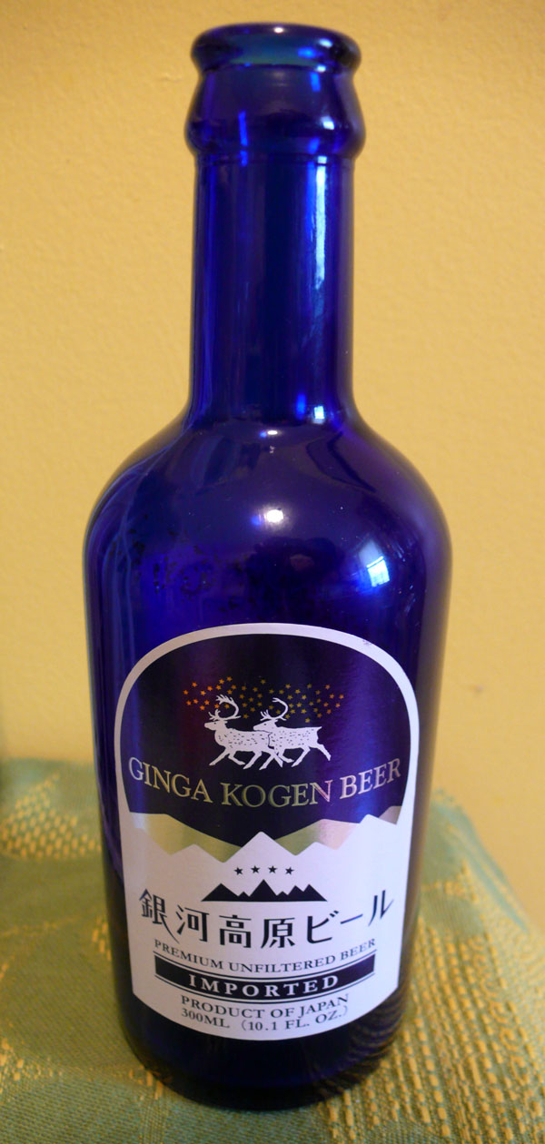
I thought it was really nice.

From New Year’s Day. Inspirations were everywhere.

Happy first Friday of the year and have a great first weekend of the year, everyone! I’ll be back with my letterpress studio visit on Monday!
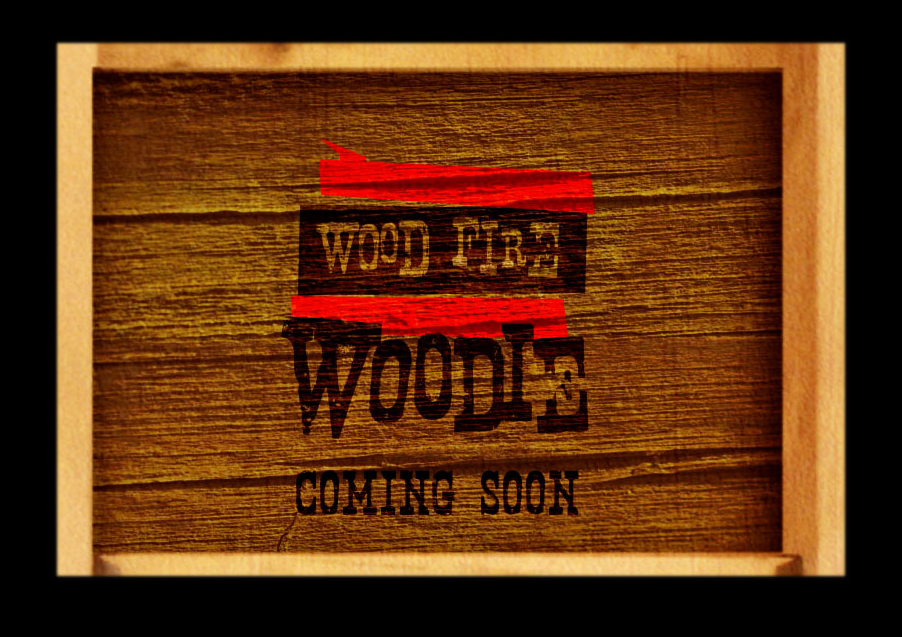
Wood Fire Woodie

I finished designing “Wood Fire Woodie” logo last year and now, we are all ready for the website design as they are getting ready for its debut. Pat and Mariah have been wonderful to work with, they are very creative and fun couple and this is very exciting for them as well as for me. I won’t explain too much of what this is here yet… you will see it soon!

wfwlogo.jpg

wfwcomingsoon.png