Hand-Lettering in SF

I watch for hand-lettering things wherever I go or whatever I see, and sure, I found some in San Francisco while I was walking around town.

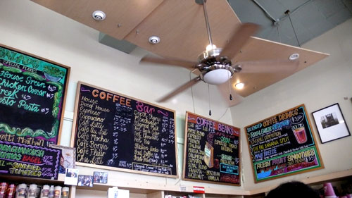
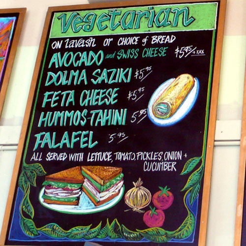
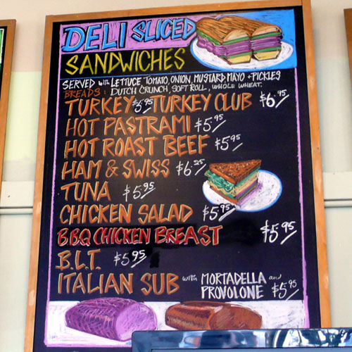
This chalk board menu I saw at a cafe is with not only great hand-lettering, but also great illustrations:
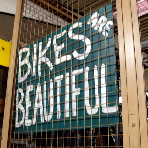
A sign by bike parking lot at Berkeley station – I like that phrase:
Polk A Dot Stationers on Polk Street – these are actually made by cut out paper! Very nice.
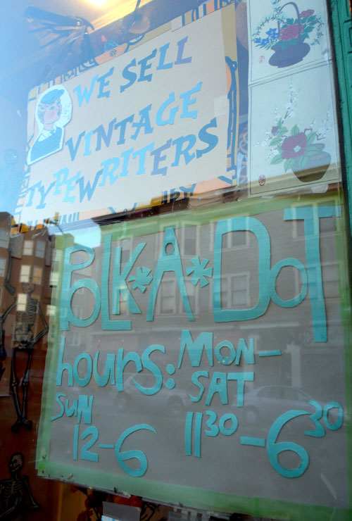
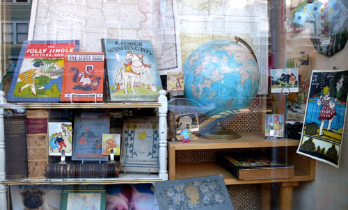
Their window had great vintage books that had nice typefaces, too. I never been inside this store and it was too early it wasn’t open… next time!
Cheese store chalk board (I couldn’t avoid the reflection…):
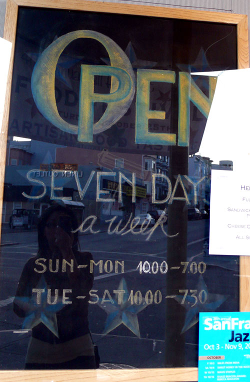
Very nice hand-lettering!

Wishing you a happy Friday, everyone!!!

See you on Monday!
Letterpress Class 2

Last Thursday, we learned how to make a polymer plate and how to print from the plate, how to do 2 color print.

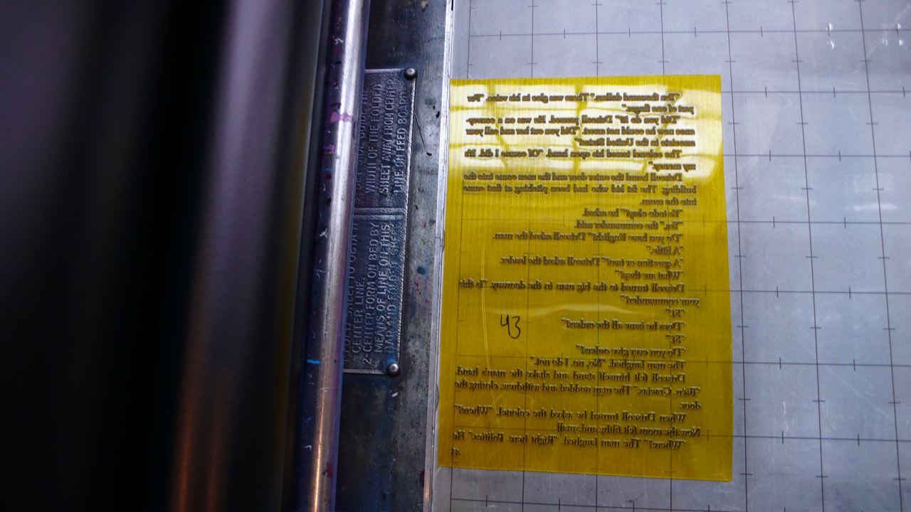
Here’s what a polymer plate looks like (I had no idea it was that thin!) – You use it with the board underneath:

I also learned about how much ink to use, I kept putting too much ink and that wasn’t good… You really don’t need that much ink to print.

So we have no class next week and we have to order the plate by following class so we can start printing from the plate – I have so many ideas and things I want to print, I have to work on it! You create a digital file and then order the plate.

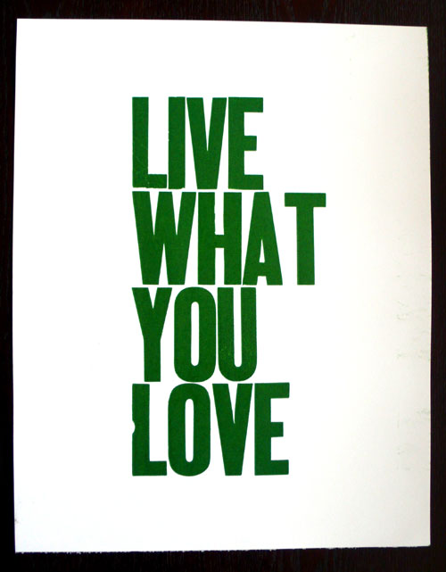
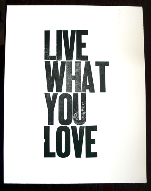
For the rest of the class, I used wood type and printed some posters:

“Live What You Love” Green:

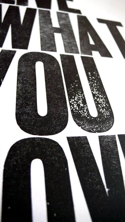
“Live What You Love” Black:

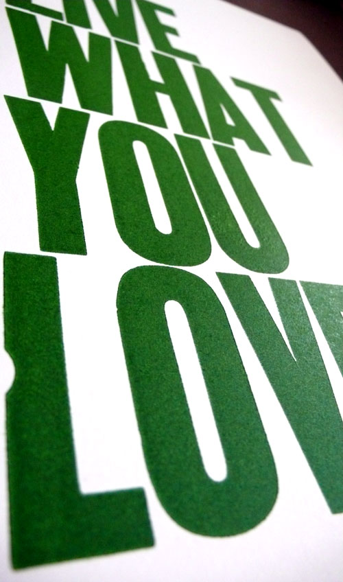
After reducing the ink (I had too much at first), the “U” showed an interesting texture:

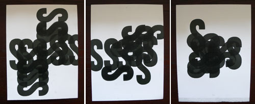
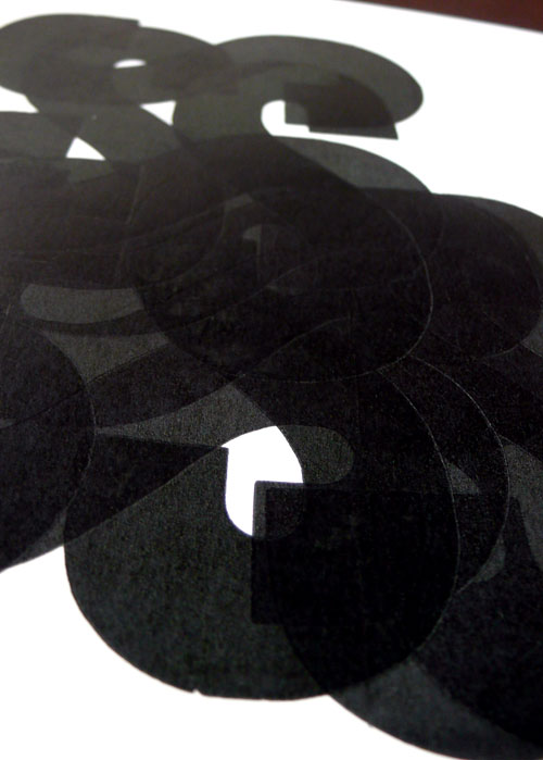
And then, I had 30 more minutes to play around so I just took letter “S” and did some fun with it:

So I’ll come back to Letterpress Monday in 2 weeks!

Ariapenciroman

I found this nice crossover of “Arial” and “Times New Roman” in pencil drawn fonts called “Ariapenciroman” over at FontStruct.


It’s pretty neat. You can view, test, and download it from here. (Please note that this work is licensed under a Creative Commons Attribution-Noncommercial-No Derivative Works 3.0 Unported License.)

You can create your own font at FontStruct, I haven’t been able to try it myself, but after seeing this, I’d love to try one now.

My Letterpress Prints

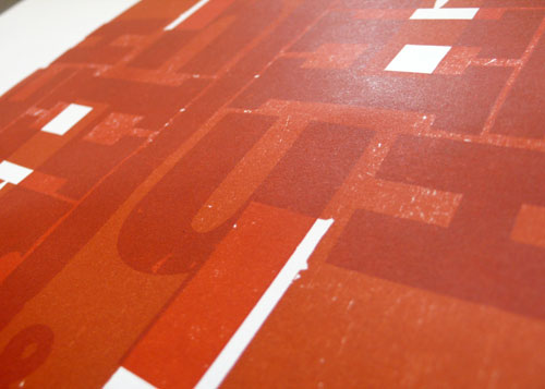
Here is my favorite work from the first class. Lot of different Hs and a few ampersands and dollar signs and printed twice in different way. I love the overlapping part, makes different red and gives different shapes.

This one had less ink and a little different red and I like the texture this one has!