A, C and G

Good morning :) Hope you all had a nice weekend and are ready for a new week! It’s going to be September… so fast… I didn’t like the heat and bugs bites (oh, I hated them!!!), but when I think about the summer is ending, I miss it already…

Anyways. I printed 3 more alphabet greeting cards and they are available now at my shop :) Here are some behind-the-scene photos as usual!

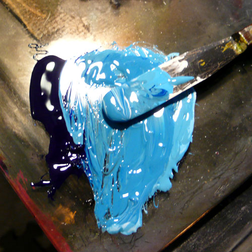
Mixing ink… I always think about if the word has a color, what color would it be before printing. Mixing pretty sky blue for…
ac1

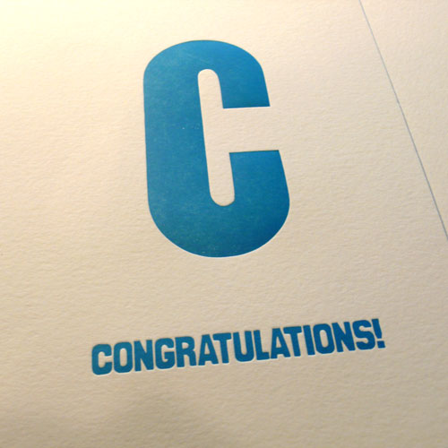
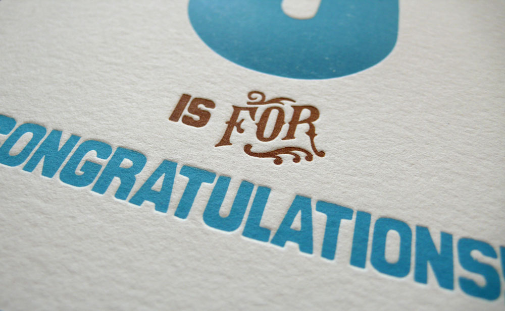
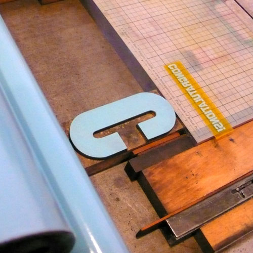
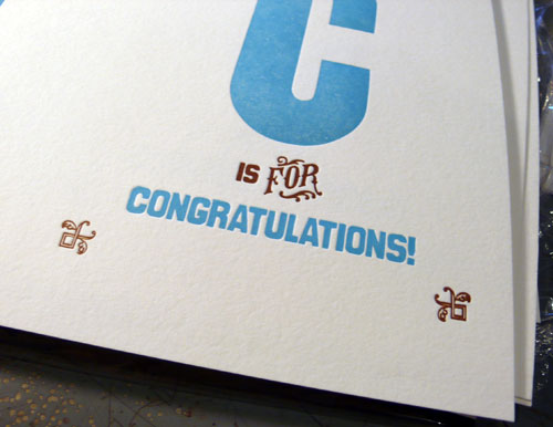
C / Congratulations! I think sky blue is nice, fresh, happy and very celebratory for any occasion. Printing wood type “C” and the plate at the same time.
ac2

1st color printed.

ac3

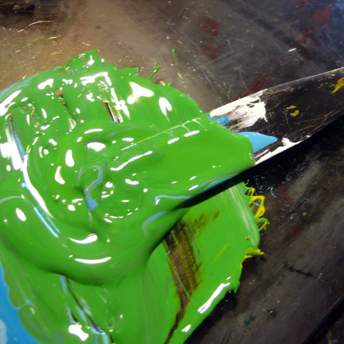
Moving on to next… mixing pretty green…
ac4

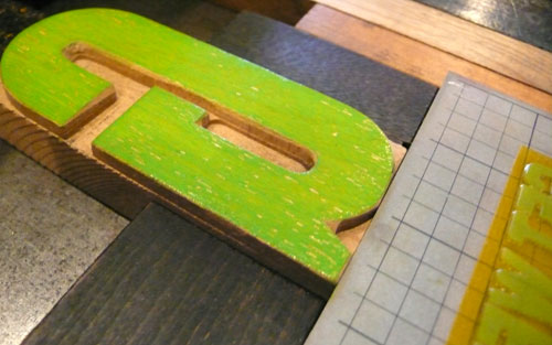
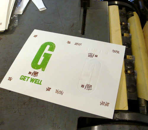
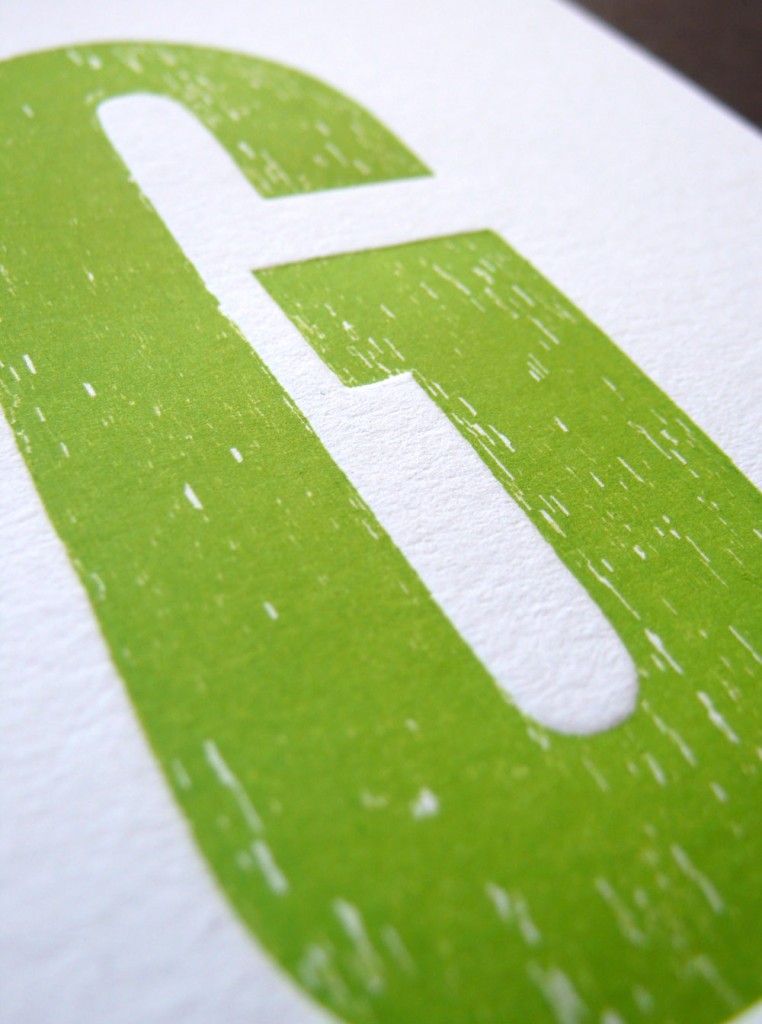
for G / Get Well — this wood type “G” was a special one, has lots of textures! Hoping this lively green makes your loved ones feel better…
ac5

1st color done.

ac6

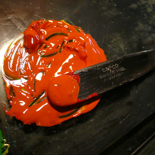
and moving on to the 3rd one… mixing nice orange…
ac7

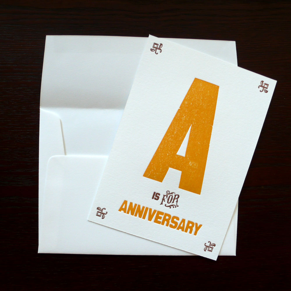
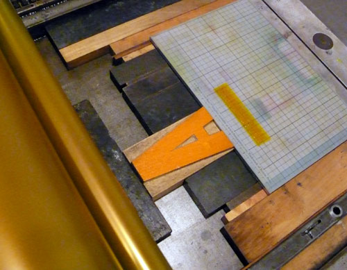
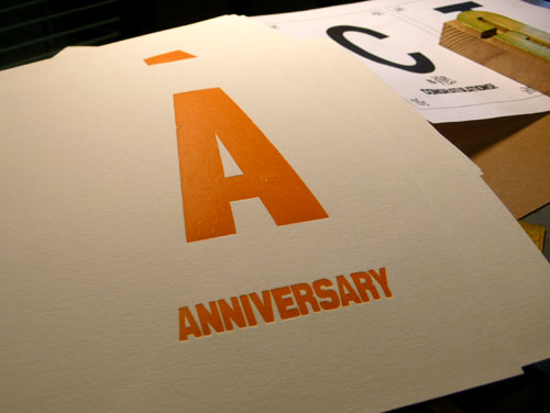
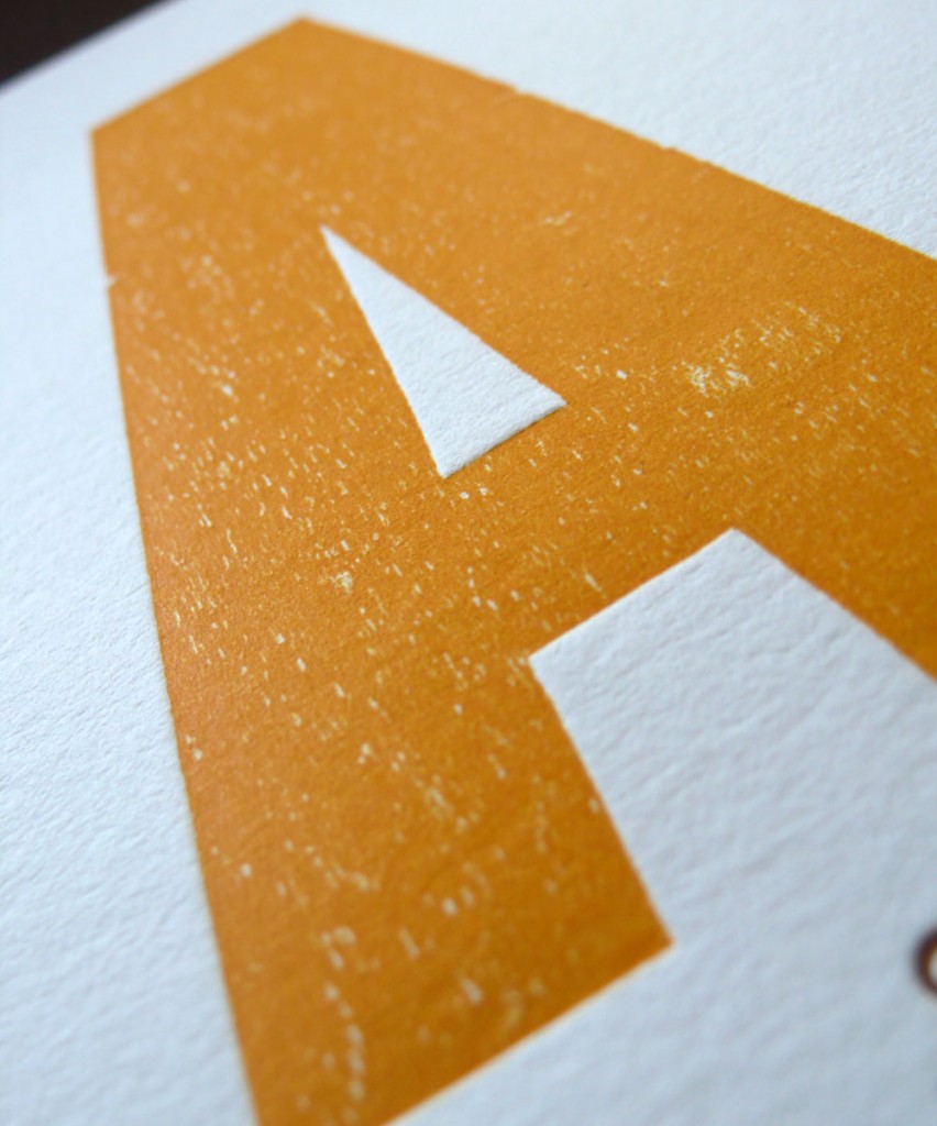
for A / Anniversary :) I thought of red at first for the love related anniversaries, but rethought and decided to go with orange — can be sent for a shop anniversary, a blog anniversary, a work anniversary… any kind of anniversaries!

Setting wood type and the polymer plate, ready to print.
ac8

I like the orange, the 1st color printed.
ac9

2nd day — the brown color day!

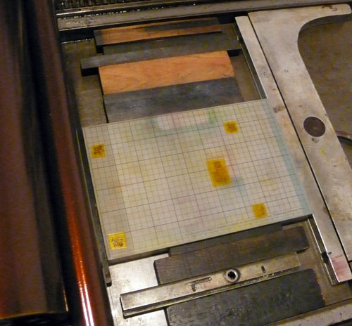
Setting up the polymer plates. The border and “is for”.
ac11

Adjustments, adjustments, adjustments…
ac10

ac13

ac14

until it’s in exact spot! :) Print away…
ac12

and here are the finished products :)
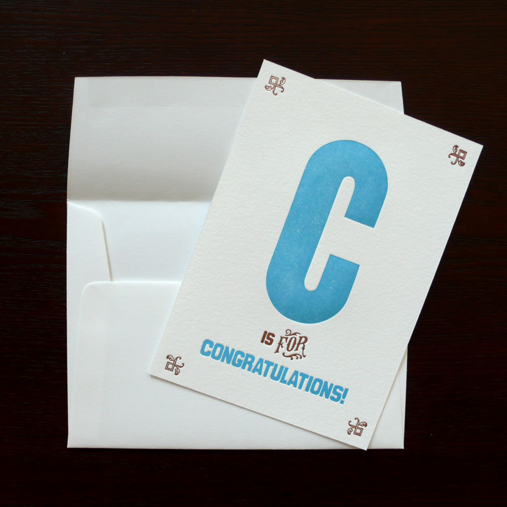
C is for Congratulations!:

congrats1

congrats3

G is for Get Well:

getwell1

You can see the wood type “G” texture more here.
getwell4

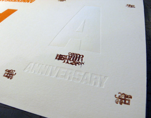
A is for Anniversary:

anniversary1

This letter “A” has a very nice texture, too!
anniversary4

Hope you enjoy.

More cards to come soon! :)
Megan’s Wedding Invitations

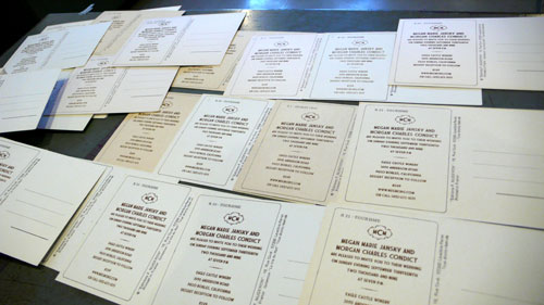
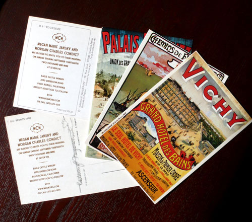
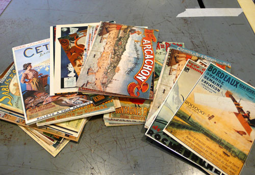
When my friend Megan talked to me about her wedding invitations, I thought it was such a great idea and I knew it would be such a fun project (and I was honored to be a little part of her special day!) so I of course said yes… to print on vintage postcards! She had a lot of them and her wedding theme matches with these awesome vintage french postcards so why not make a great use out of them, right? I thought it was so original and cute and so Megan.

Look at all the cool postcards…

megans5

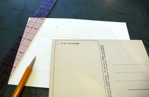
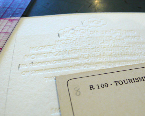
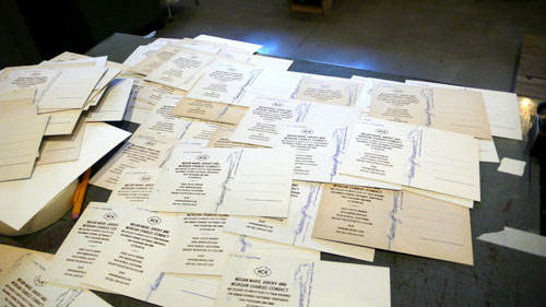
She sent me few extras, but to set the plates in the right position, I used another paper to determine the placement…

megans2

megans3

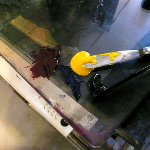
Mixing brown color…

megans

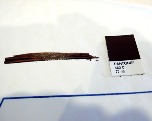
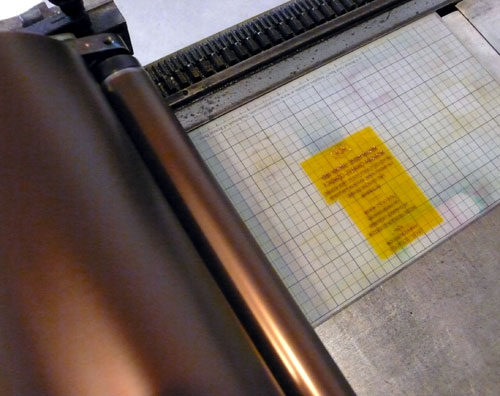
Matching Pantone.

megans1

and ready to print.

megans4

The postcards came in 2 different types of the back and this is #1:

megans6

#2: adjusted the position to this background.

megans7

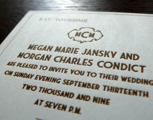
and it came out just lovely!

megans8

megans9

I love how it came out! So special. :)

I am actually looking for a wedding stetinary project (from save-the-date, invitations, RSVP cards to Thank you cards, programs…. everything!) if you are interested or if you know someone who just got engaged and you think they might be interested, please let me know!

Happy Friday!

Wilkintie

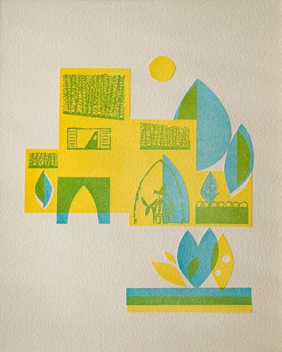
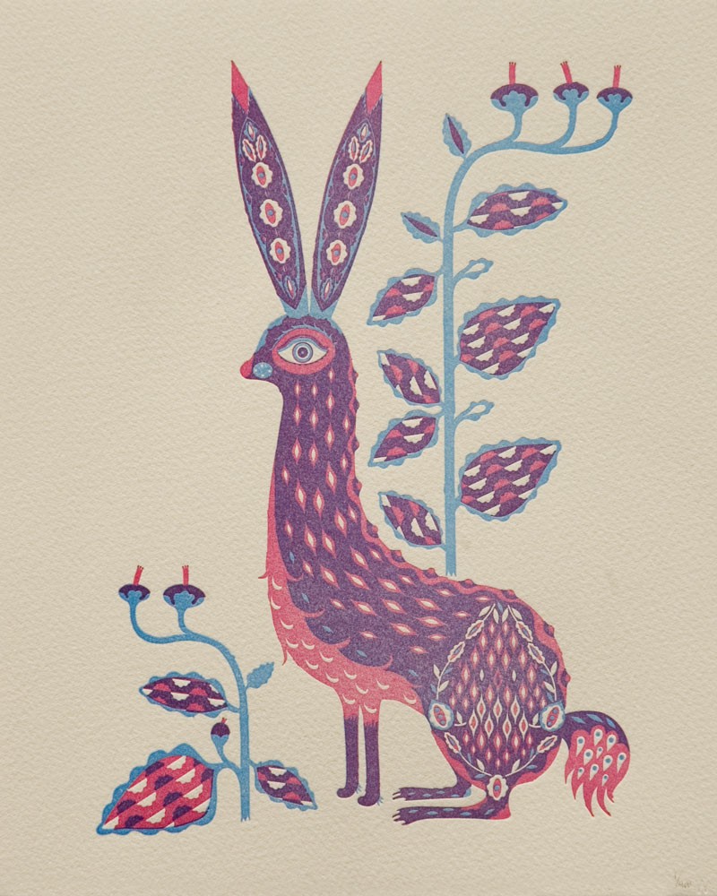
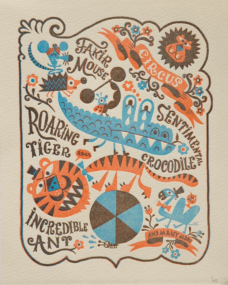
Beautiful letterpress prints by Wilkintie for inspirations… Love the overlapping part and the usage of colors and everything. They are all so stunning…

John Copeland for Wilkintie:

wilkintie1

Rabbit by Klaus Haapaniemi:

wilkintie2

Circus by Chamo:

wilkintie3

New Posters

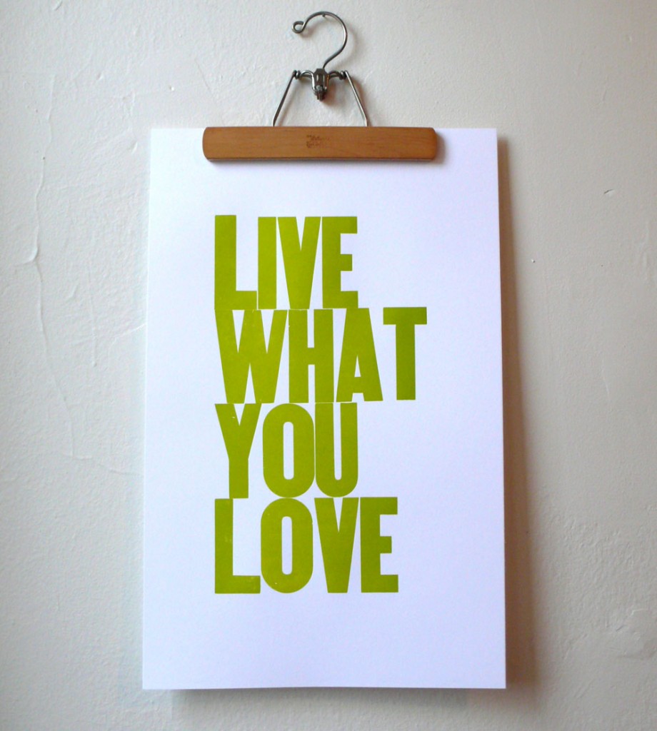
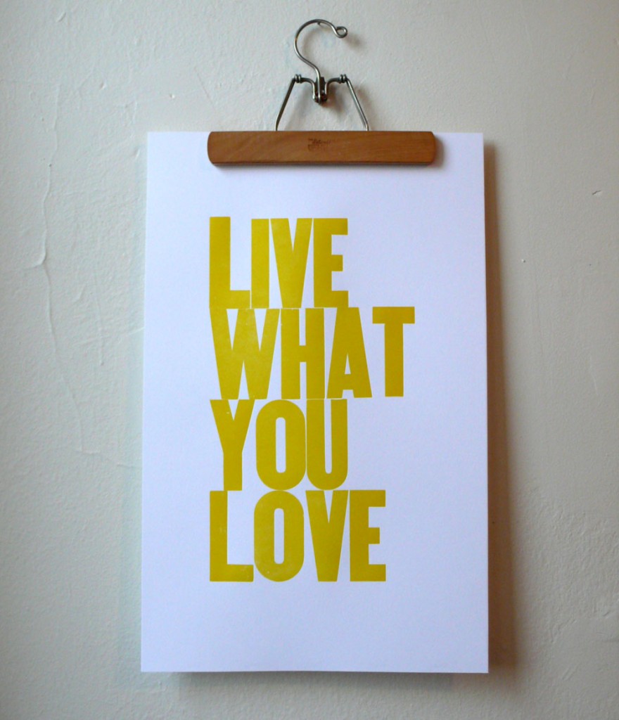
Just a quick announcement to let you know that the new Live What You Love posters are now available!

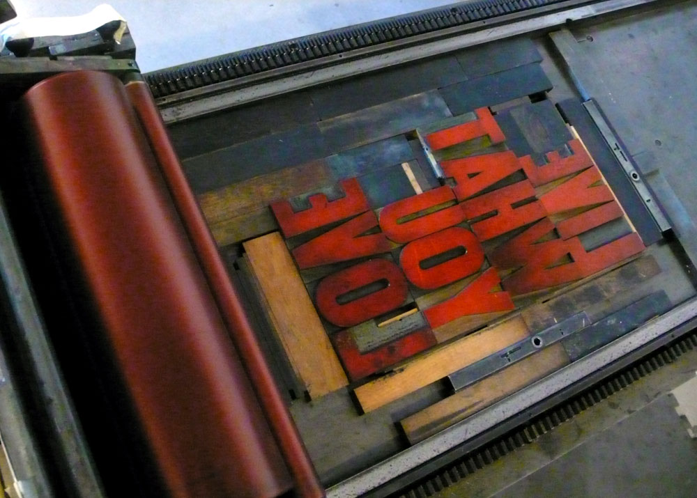
Type setting… it is like a puzzle. Lock all the letters in place.

red5

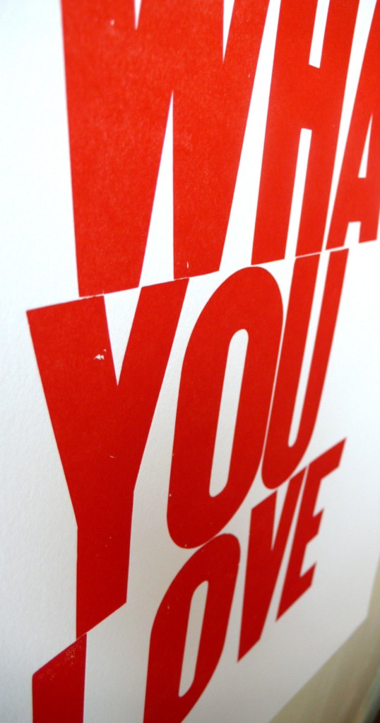
I actually hadn’t printed in red before so I printed the red one this time.

red1

red4

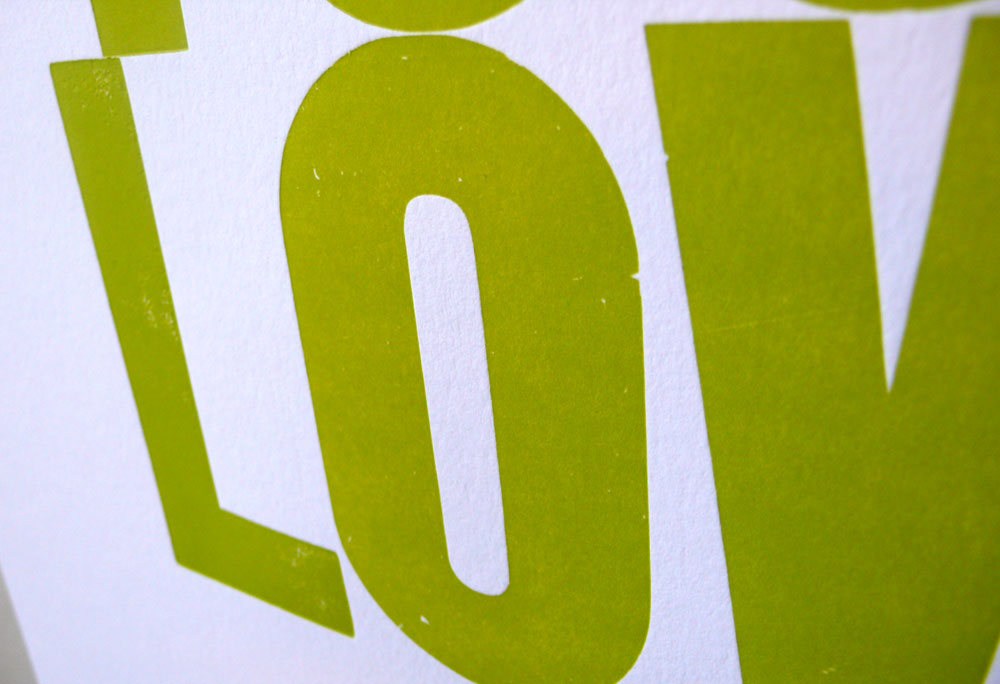
I printed green ones again, this one is more like yellow-green.

greenv2_1

greenv2_2

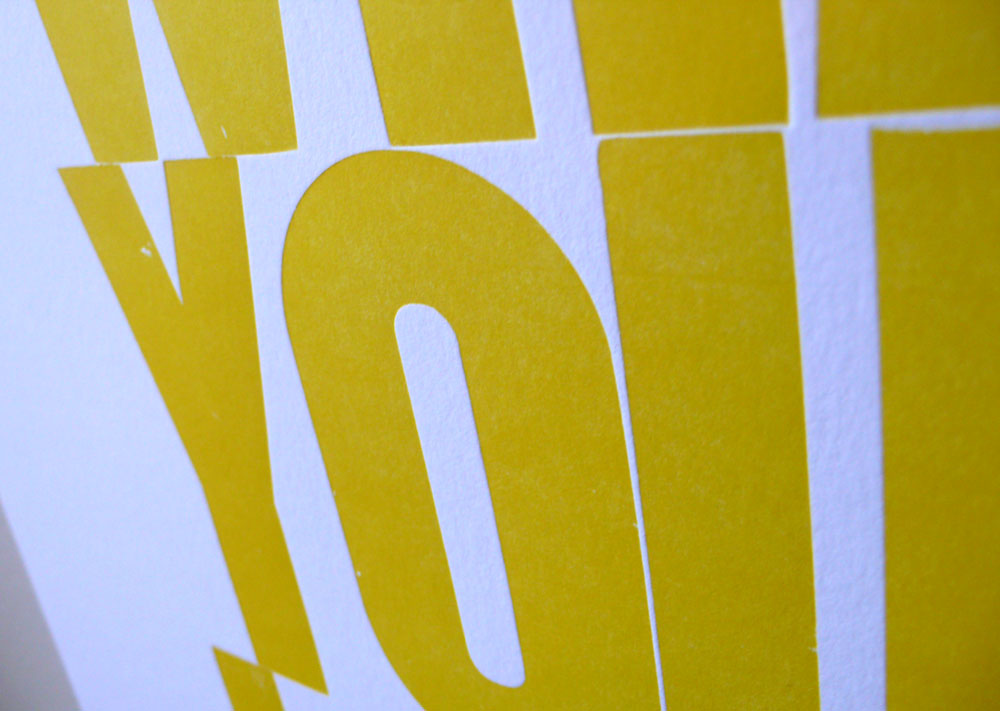
and the popular yellow ones are back in stock.

yellowv3_1

yellowv3_3

They are limited to 10 posters each. So hurry if you are interested :)

Hope you had a nice weekend!