At Fenway park, I saw a wall of Budweiser logo history gallery. From way back in 1936 to 1996… I was surprised to see some of the logo design they had.
1936: I guess this was the first Budweiser logo. Very classic.
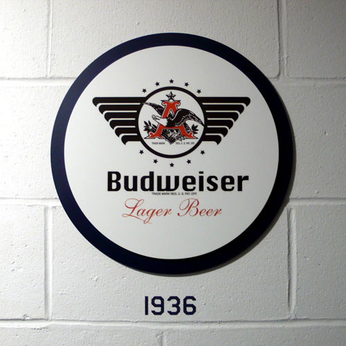
1947: They added lots of lines… it looks like an ad or something.
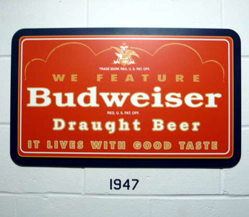
1948: Went back to simple execution. I like this one.
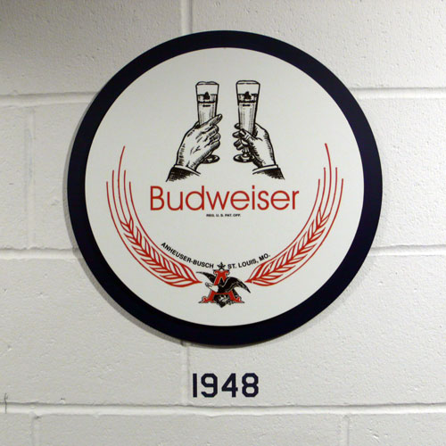
1952: Different interesting shape…
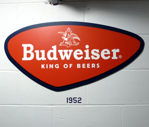
1955: How fun. I love the shapes, very retro.
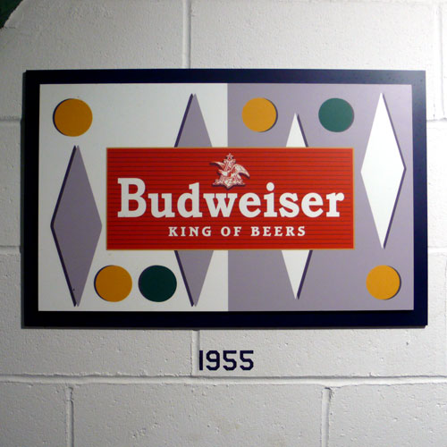
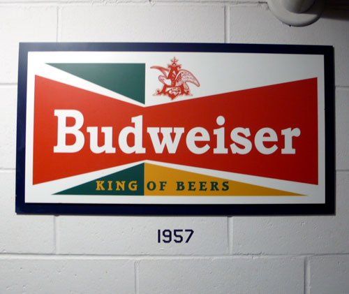
1957: Similar from the previous one, played with shapes… it looks a bit unbalance to me…?
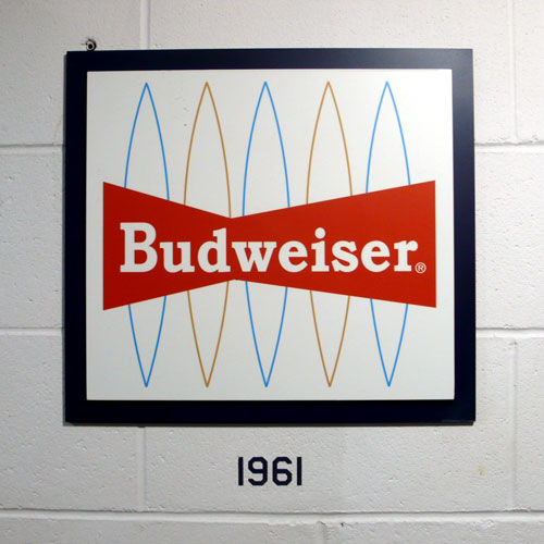
1961: This one is very retro, too. I like the line shape on the background.
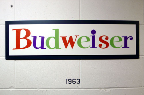
1963: this one surprises me… it doesn’t look like Budweiser / beer logo at all. Looks fun, though.
((and there was a beer booth in between here….!))
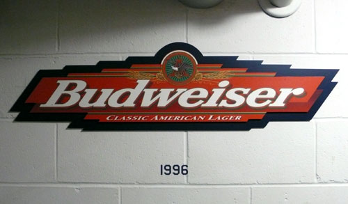
1996: I remember this one. I’m not sure what happened in between 1963 to 1996…
Thursday morning inspiration. Have a great day!


