Tallow Berry Bulb

Good morning! I hope you had a nice weekend… We had a little dachshund friend Audrey for the weekend to dog-sit, it’s been fun for us and Maia :)

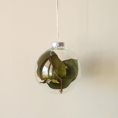
Over the weekend, I came across these beautiful glass bulbs from Land-Rich (via sub-studio design blog – they have my favorite gift guide every year by colors!) and I especially like this Tallow Berry Bulb — isn’t it a precious little thing? I would love to get one for our Christmas tree… this will be my ornament of the year… (speaking of which, I finally decorated my Christmas trees this weekend, I will share some photos later! Yes, I have 2 trees this year!)
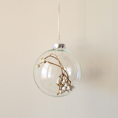
bulbwhite

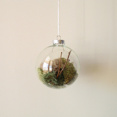
They have 3 other ones, they are all so special.

About Land-Rich: Inspired by raw nature and those who embrace it, we collect and design classic goods for the discerning customer. Our mission is to provide beautiful objects that symbolize the quality, functionality, and sustainability of simpler times.
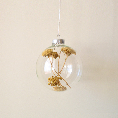
bulbyellow

bulbmoss

bulbgreen

Let’s have a beautiful week, shall we? :)
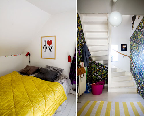
I Heart…

This week, I saw some more “I Heart” things…

ihearttv

(via Bloesem)

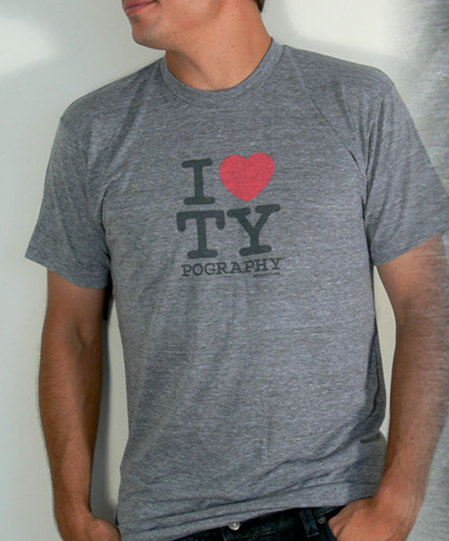
ihearttypography1

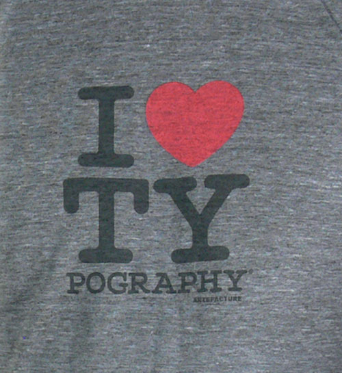
ihearttypography2

(via swiss miss — available here.)

And did you know this is all coming from an advertising campaign for New York City?! (I tried to look for the original commercial on YouTube, but I couldn’t find the right one…) I didn’t know that until I saw the movie Art & Copy — pretty amazing to think about how ad campaign effects soo many things even 30-40 years later!

Happy Friday, everyone!!

Catch Me if You Can Opening Title Sequence

Yes, I know, this is from 2002, but I watched “Catch Me if You Can” on the TV over the weekend and saw this amazing opening title sequence again and I remembered the first time I saw this — I was so drawn to it and thought it was one of the best opening title sequences ever. It’s been always in my head ever since, but I didn’t have a blog to post my inspirations at that time so I’m doing it now. Still gets me every time… so good! Love the music, too. Very inspiring and well done. Love the typography and the illustration, all works so well together. Enjoy!

LAMA Halloween Newsletter

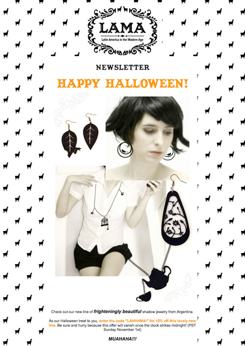
I always have so much fun designing anything for LAMA since the day one. Their newsletter is one of my fun work I get to do and this month, it is Halloween themed… but very elegant and cool, fun, and edgy LAMA way!

They are introducing a new line of gorgeous jewelry, I was in love with them right away, and I thought instead of making the newsletter looking more spooky or Halloween-like, I just turned the llama pattern (usually in blue) and everything black — let the picture talk itself.

I love how it came out :) Maybe you can see the LAMA blog for some discount code…

lamahalloween1

Halloween is tomorrow! aww I am so not ready… it’s been crazy busy… but I will pull out something and have fun for sure!