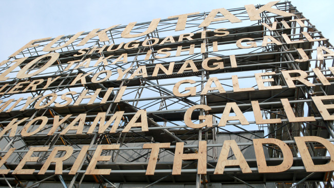
Fukutake House 2010

Continuing my posts from Megijima this week…

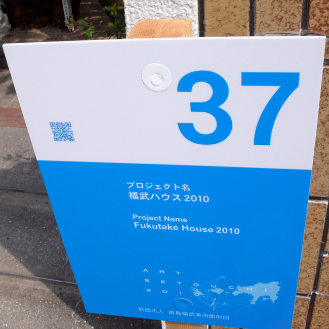
#37 :: Fukutake House 2010

Fukutake House is a project started by seven of Japan’s leading art galleries and the University of Tokyo’s University Museum at the “Echigo-Tsumari Art Triennial 2006,” in response to a call from Soichiro Fukutake to create an art market in Echigo-Tsumari. At the following Echigo-Tsumari Art Triennial in 2009, art galleries from China and Korea joined the call, and the total number of attendees more than doubled that of 2006. For the third opening of the Fukutake House, we are moving it to Megijima Island to give it a new try in a new location. This time, we plan not only to be joined by galleries from Asia, but also by galleries and art museums from throughout the whole world. We plan to open the Fukutake House at the former Megijima Elementary School and Preschool, which are currently not being used.

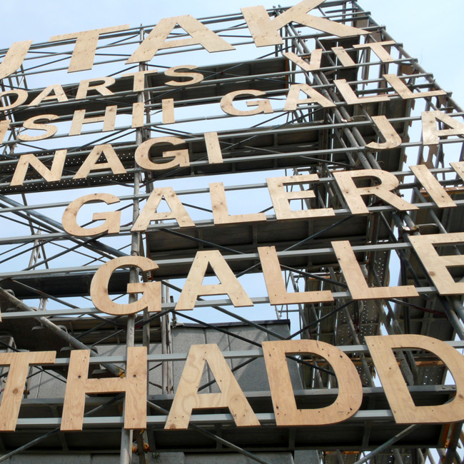
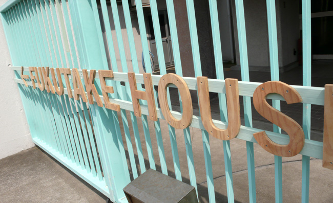
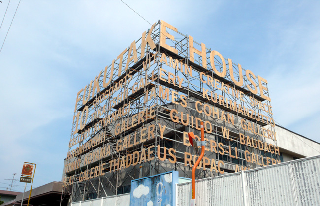
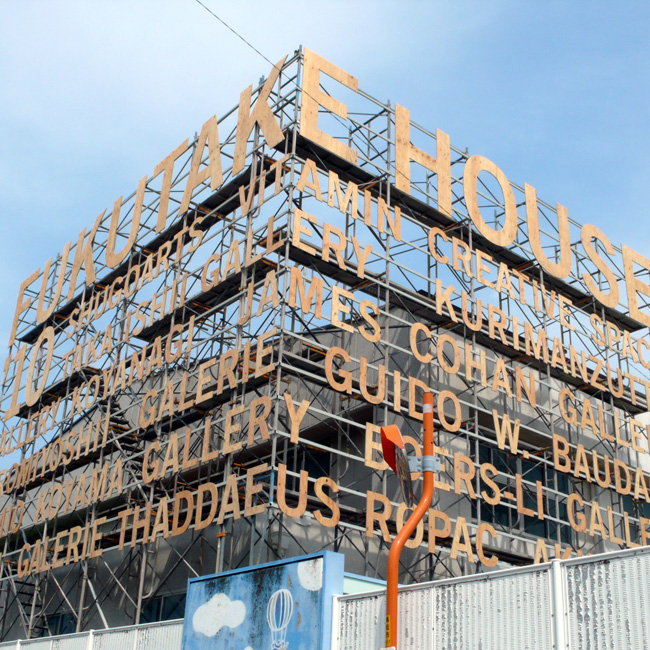
I loved this one personally, not only I could see lots of different art from art galleries all over the world (inside is strictly NO photography so no photos to share), but also…
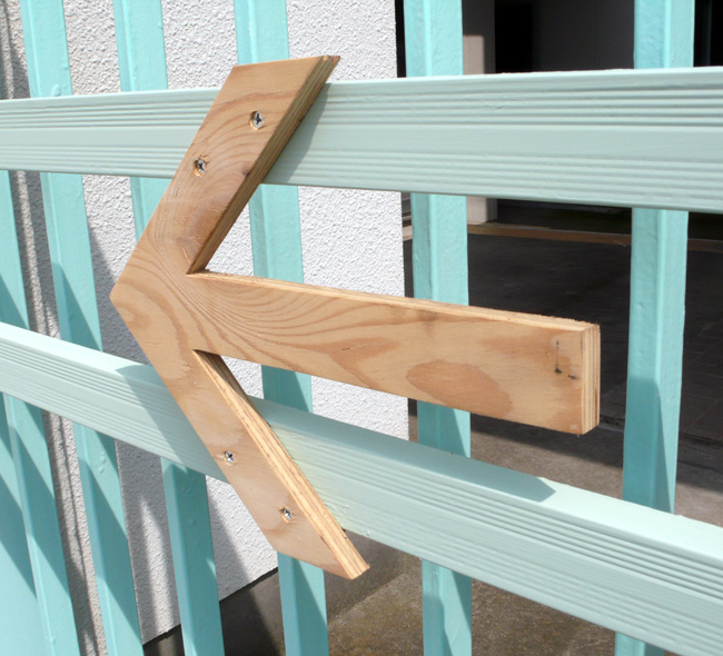
all these typographic installation!! As soon as I saw it, I was in love :) Inside the school (yes, they took over Megijima Elementary School & Preschool, which was another awesome part of this project.), throughout the exhibition, these wooden letters are used for art work titles and indication of the different rooms etc… I loved it!
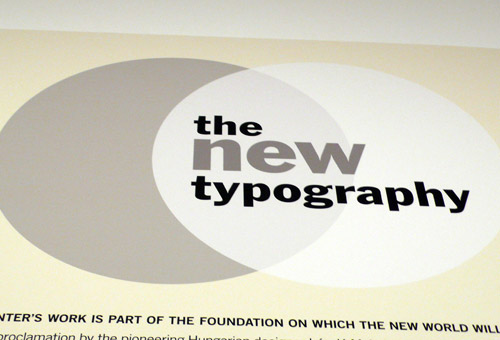
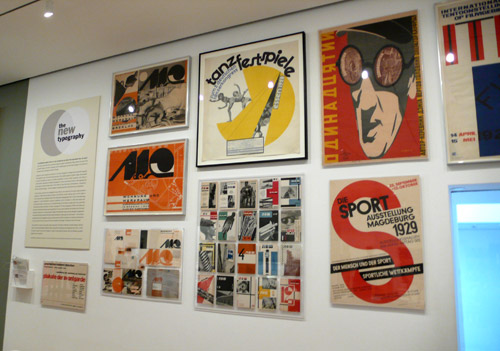
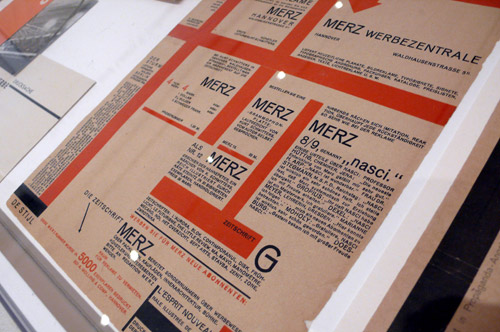
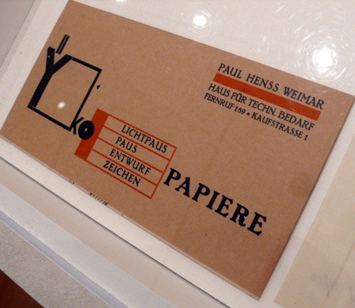
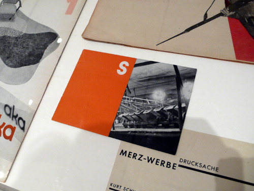
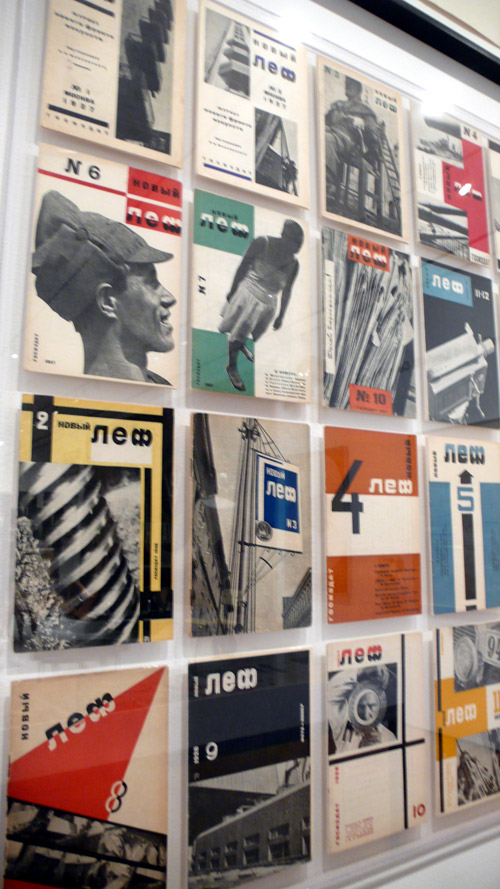
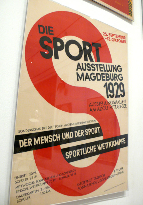
The New Typography at MoMA

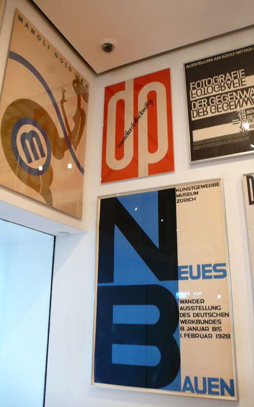
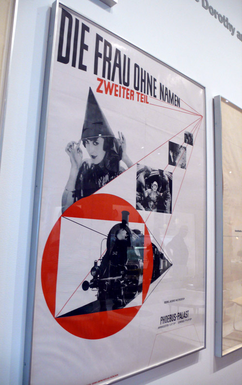
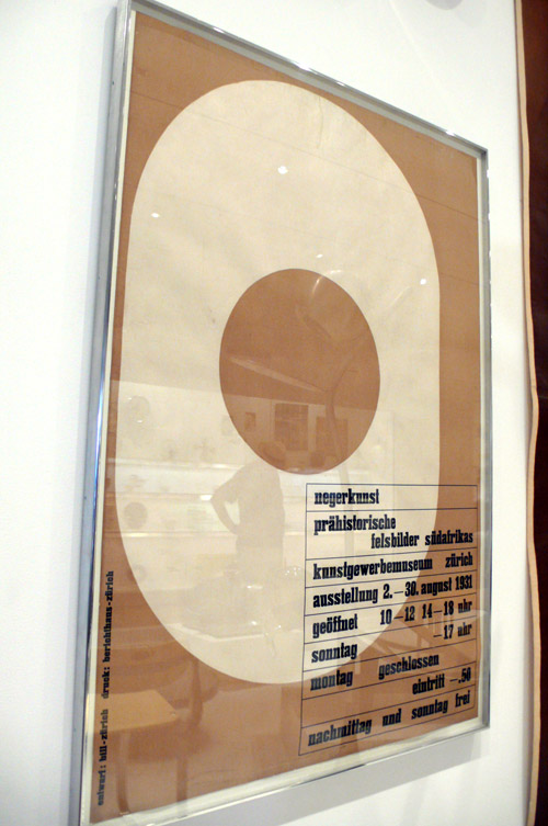
Just finally getting around to this great exhibition I saw at MoMA the other day… The New Typography. It’s a small exhibition, but I loved it the most. I wish my office / home is filled with typography posters like this… or I wish they make this exhibition into a book…

Enjoy some photos I took!

Happy Friday, everyone, I hope these will inspire your day!! xo

Inspiration: MoMA Visit 1

Last Sunday, I visited MoMA and found lots of inspirations — will have couple more posts later, but here, I wanted to share some typographic inspirations from the walls. Love looking at museum walls besides the exhibition (of course) because it always has cool design and typography.

Bruce Nauman: Days (very interesting exhibition – “sound sculpture”)

A huge wall full of days. Monday through Sunday. Not in exact order. Caught my eye. (and makes sense for the exhibition, too)

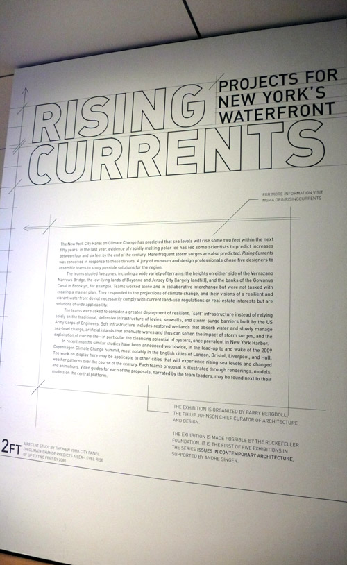
Rising Currents: Projects for New York’s Waterfront (also an interesting exhibition)

I liked the project description wall. Nicely designed.

and this was on the 2nd floor wall — I’m not sure if this is a work in progress or if this is it… I didn’t see any project caption or anything, but either way, it caught my eye.

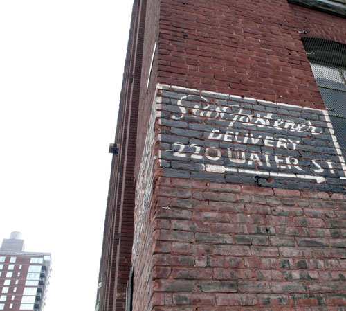
Found Type: DUMBO

Found them around corner from my loft. These signs are everywhere around here, they get me every time! So great.

Modern Box Office >>> ((Love the arrow with the word “office”))

I can’t really read this one… but equally cool.

Happy Friday!