Typography at MoMA

One more post from MoMA visit. Cool typography treatment caught my eye as always. Word itself can be really strong, but with typography design, it gets even stronger and very powerful.

moma1.jpg

moma2.jpg

moma3.jpg

moma4.jpg

moma5.jpg

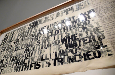
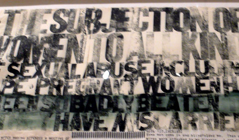
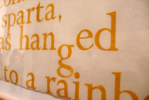
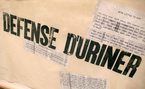
Very cool – it was all letterpressed, too:

moma6.jpg

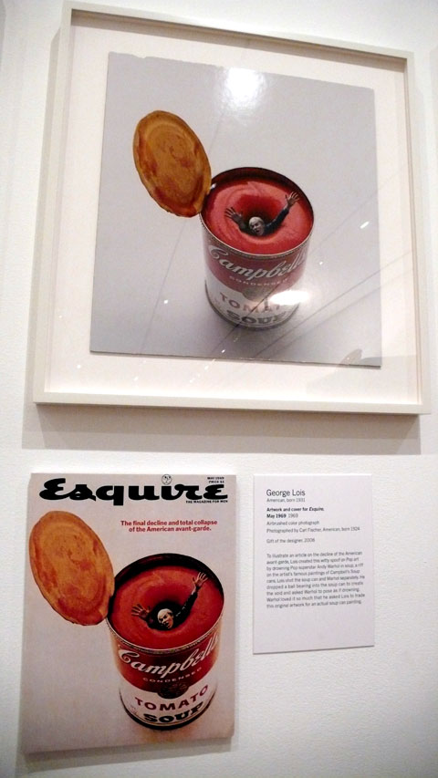
This is a small cool exhibition that’s going on at MoMA: George Lois – The Esquire Covers

moma7.jpg

You can see images from the photo shoot, slides from the cover shoots, rough sketches to finish etc. It’s great to see behind the scene process and the concepts – here’s Andy Warhol’s cover:

moma8.jpg

Hoefler & Frere-Jones

I get inspired by fonts a lot and tonight was no exception. Just wanted to post about Hoefler & Frere-Jones (H&FJ) at typography.com because their site is really great to look at – you can see and learn about fonts, find the fonts, buy the fonts… I especially like the features they have.

Gotham” page, for example, they have the font’s overview with designs by using the fonts:

h_fj1.jpg

h_fj1_2.jpg

h_fj1_e.jpg

(I like the color usage, too)

You can learn about the history (if the font has any):

h_fj2.jpg

and you can “test drive” it:

h_fj3.jpg

and they have a blog about fonts, too!

Candy Cushions

I’ve been looking at this Candy Script cushions from Veer. Not that I need another cushions at home, but they are just fun and cool. Maybe for my home office…$40 for set of two! It says it’s handmade, which sounds better as always.

veercushion.jpg