One more post from MoMA visit. Cool typography treatment caught my eye as always. Word itself can be really strong, but with typography design, it gets even stronger and very powerful.
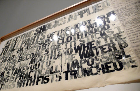
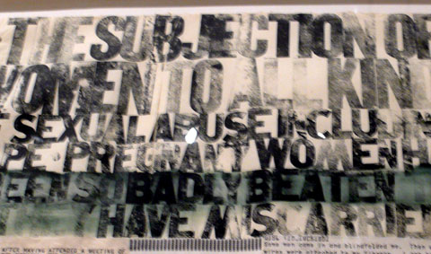
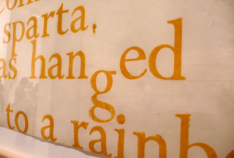
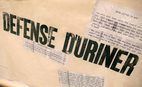

Very cool – it was all letterpressed, too:

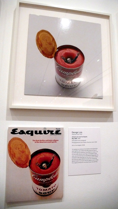
This is a small cool exhibition that’s going on at MoMA: George Lois – The Esquire Covers

You can see images from the photo shoot, slides from the cover shoots, rough sketches to finish etc. It’s great to see behind the scene process and the concepts – here’s Andy Warhol’s cover:
